Remember that
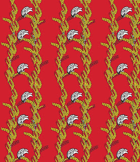
link I posted to the Nazi design manual? I decided to try to make some repeat patterns using some of the images from the badges and pins illustrated in the manual. I wanted to go for a fairly conventional repeat to contrast with the dark source. Here are my first attempts.
For this design I wanted to create something that looked fairly traditional, inspired by the very ordered but very busy designs of Victorian wallpapers. I wanted to suggest that images are corruptible when used in a different context. The Nazi party themselves took traditional images and bent them to their purposes: the swastika is a pre-Christian good luck symbol (still used in some Buddhist and Hindu art but now out of use in the West for obvious reasons), the eagle motif was inspired by ancient Roman military symbols and so on. I wanted to take these motifs and turn them into something beautiful to subvert their source and to hint at the persuasiveness of the Nazi propaganda machine.

The leaves are from patches that would have been sewn onto the collar of an officer, the eagle is from a medal. I think the first pattern, with the vertical stripes, is more effective that the second; it was difficult to make the pattern feel balanced and ordered with the more random style. Although this design is slightly more disordered than I would like, the basic concept I was playing with here still shows: turning the very ordered, clean designs of the originals into something more fluid and organic. I wanted to suggest that over time these motifs could outgrow their source material and take on new meanings.
The original images are


Emma, you are creating some very interesting work here and personally I prefer the Blue piece, although context is everything with work like this, and perhaps a slightly looser pattern doesn't sit well with the Nazi ethos. You have to be incredibly careful using subject matter such as this, it will not fail to offend people, so you would need to be really clear about exactly what it is that you are trying to say. An artist to look at would be Robert Gober, especially his work titled 'hanging man, sleeping man'. This is a really good example of pattern and imagery fitting the context of the work.
ReplyDeleteFor this project I would recommend that you stay with your drawings/skulls and perhaps come back to exploring Nazi imagery in a Fine Art project, where you can go into greater depth and it would be part of something larger. Anyhow... keep developing those patterns, you are getting some fantastic outcomes.